- Applicable PackagesLite Plus Max Shop
The choice component, whose option icon is shown below, creates a field in a form letting the visitor select from a number of choices.

The choice can take the form of a drop-down menu, radio buttons, or checkboxes, as shown below. Drop-down menus and radio buttons allows a single choice to be selected, while checkboxes allow multiple choices to be selected.

Editing choices
Click on the choices to open the choice window:
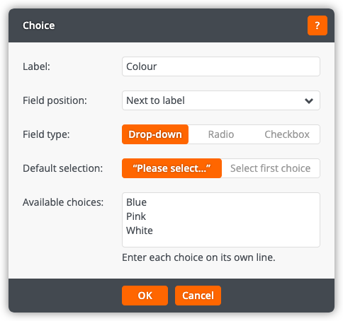
The choice window lets you change the following settings:
Label
The label for the field.
Field position
Whether the field is shown next to the label, below the label and full width, or below the label and indented (in order to line up with fields displayed next to their labels).
Field type
Whether the choices are displayed as a drop-down menu, radio buttons, or checkboxes. A drop-down menu allows the visitor to select one choice from the menu — this type should be used when the list of choices is long (for example, the countries of the world) as it takes up little space in the form. Radio buttons allow the visitor to select one choice from a list of choices visible at all times — this type should be used when the list of choices is short as the visitor can see all of the choices at one time. Checkboxes allow the visitor to select any number of choices from a list of choices visible at all times — this type should be used when the visitor needs to be able to select multiple choices.
Default selection
Whether to show a “Please select…” message or to select the first choice by default. This setting is only shown when the field type is 'drop-down'.
Available choices
The choices available to the visitor. Enter each choice on its own line.
Click OK to apply the changes to the choices. Click Cancel to return to the page without changing the choices.
